
Animated CSS Cards Tutorial
The following lesson demonstrates how to build an animated card collection inspired by the 2020 homepage of css-tricks.com.
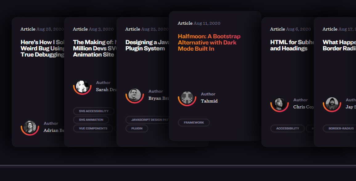
The original version on CSS tricks
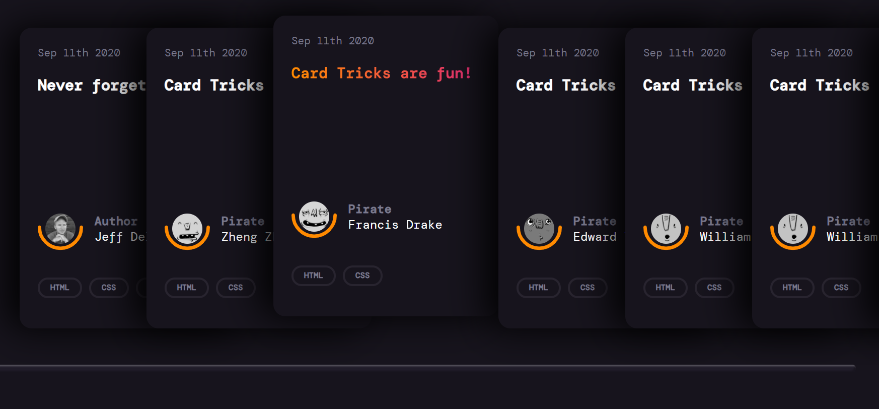
The cloned card stack
Stacked Card
Start by adding the following HTML markup.
HTML
 <section class="card-list">

      <article class="card">
        <header class="card-header">
          <p>Sep 11th 2020</p>
          <h2>Never forget</h2>
        </header>

        <div class="card-author">
          <a class="author-avatar" href="#">
            <img src="avatar.png" />
          </a>
          <svg class="half-circle" viewBox="0 0 106 57">
            <path d="M102 4c0 27.1-21.9 49-49 49S4 31.1 4 4"></path>
          </svg>

          <div class="author-name">
            <div class="author-name-prefix">Author</div>
            Jeff Delaney
          </div>
        </div>

        <div class="tags">
          <a href="#">html</a>
          <a href="#">css</a>
          <a href="#">web-dev</a>
        </div>
      </article>

      <!-- Add more cards here -->


 </section>
Layout
The cards use a flexible row container for the layout. Optionally, the scrollbar can be customized in this step.
@import url('https://fonts.googleapis.com/css2?family=DM+Mono:wght@300;400;500&display=swap');

body {
    padding: 0;
    margin: 0;
    background-color: #17141d;
    color: white;
    font-family: 'DM Mono', monospace;
}

.card-list {
    display: flex;
    padding: 3rem;
    overflow-x: scroll;
}


.card-list::-webkit-scrollbar {
    width: 10px;
    height: 10px;
}
.card-list::-webkit-scrollbar-thumb {
    background: #201c29;
    border-radius: 10px;
    box-shadow: inset 2px 2px 2px hsla(0,0%,100%,.25), inset -2px -2px 2px rgba(0,0,0,.25);
}

.card-list::-webkit-scrollbar-track {
    background: linear-gradient(90deg,#201c29,#201c29 1px,#17141d 0,#17141d);
}


.card {
    display: flex;
    position: relative;
    flex-direction: column;
    height: 350px;
    width: 400px;
    min-width: 250px;
    padding: 1.5rem;
}
Stacked Animation & Shadows
Adding a box-shadow with a negative horizontal offset makes the cards looks like they’re stacked on top of each other.
The ~ general sibling combinator is used to select all cards AFTER the hovered card, then applies a translation to slide them to the right.
.card {
    /* ... */

    border-radius: 16px;
    background: #17141d;
    box-shadow: -1rem 0 3rem #000;

    transition: .2s;
}

.card:hover {
    transform: translateY(-1rem);
}

.card:hover~.card {
    transform: translateX(130px);
}


.card:not(:first-child) {
    margin-left: -130px;
}
SVG Semicircle Border
The author avatar uses grid layout, then places the SVG semicircle under the avatar with absolute positioning.
.card-author {
    position: relative;
    display: grid;
    grid-template-columns: 75px 1fr;
    align-items: center;
    margin: 3rem 0 0;
}

.author-avatar img {
    display: block;
    width: 40px;
    height: 40px;
    border-radius: 50%;
    filter: grayscale(100%);
    margin: 16px 10px;
}

.half-circle {
    position: absolute;
    bottom: 0;
    left: 0;
    width: 60px;
    height: 48px;
    fill: none;
    stroke: #ff8a00;
    stroke-width: 8;
    stroke-linecap: round;
}
Background Gradient Text
A gradient text background cannot be applied with the color property. Instead, set the background as a gradient, the clip around it.
.card-header {
    margin-bottom: auto;
}

.card-header p {
    font-size: 14px;
    margin: 0 0 1rem;
    color: #7a7a8c;
}

.card-header h2 {
    font-size: 20px;
    margin: .25rem 0 auto;
    cursor: pointer;
}

.card-header h2:hover {
    background: linear-gradient(90deg,#ff8a00,#e52e71);
    text-shadow: none;
    background-clip: text;
    -webkit-background-clip: text;
    -webkit-text-fill-color: transparent;
}
Tags
Lastly, the card contains a set of tags that also use the gradient text trick when hovered.
.tags {
    margin: 1rem 0 2rem;
    padding: .5rem 0 1rem;
    line-height: 2;
    margin-bottom: 0;
}

.tags a {
    font-style: normal;
    font-weight: 700;
    font-size: .5rem;
    color: #7a7a8c;
    text-transform: uppercase;
    font-size: .66rem;
    border: 3px solid #28242f;
    border-radius: 2rem;
    padding: .2rem .85rem .25rem;
    position: relative;
}

.tags a:hover {
    background: linear-gradient(90deg,#ff8a00,#e52e71);
    text-shadow: none;
    -webkit-text-fill-color: transparent;
    -webkit-background-clip: text;
    -webkit-box-decoration-break: clone;
    background-clip: text;
    border-color: white;
}