
Multi-Level Dropdown Menu with React
The following tutorial demonstrates how to build animated dropdown menu with React. It is inspired by Facebook’s March 2020 web UI update.
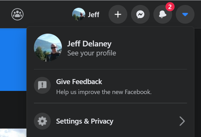
Facebook’s new UI in 2020
Initial Setup
Start by creating a new app with CRA and install the React Transition Group package to handle animation.
npx create-react-app facebook

cd facebook
npm i react-transition-group

npm start
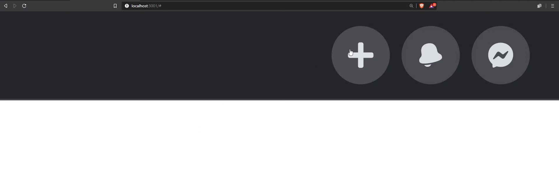
Top Navigation
Build a simple flexbox navigation bar to give the dropdown some context.
A basic flexbox navbar in React
React
import React from 'react';

function App() {
  return (
    <Navbar></Navbar>
  );
}

function Navbar(props) {
  return (
    <nav className="navbar">
      <ul className="navbar-nav">{props.children}</ul>
    </nav>
  );
}
CSS
:root {
  --bg:  #242526;
  --bg-accent: #484a4d;
  --text-color: #dadce1;
  --nav-size: 60px;
  --border: 1px solid #474a4d;
  --border-radius: 8px;
  --speed: 500ms;
}

ul {
  list-style: none;
  margin: 0;
  padding: 0;
}

a {
  color: var(--text-color);
  text-decoration: none;;
}

/* Top Navigation Bar */

/* <nav> */
.navbar {
  height: var(--nav-size);
  background-color: var(--bg);
  padding: 0 1rem;
  border-bottom: var(--border);
}

/* <ul> */
.navbar-nav {
  max-width: 100%;
  height: 100%;
  display: flex;
  justify-content: flex-end;
}
Icon Button
Next, give the navbar some children in the form of Icon Buttons. You will need to add your own SVG icons to the project, or use the ones in the source code, or just use an emoji string 🔥.
SVG Icon buttons for navigation
React
The NavItem has an open state with will show its children (the dropdown) when truthy.
import React, { useState } from 'react';

import { ReactComponent as BoltIcon } from './icons/bolt.svg';

function App() {
  return (
    <Navbar>
      <NavItem icon={<BoltIcon />} />
      <NavItem icon="🔥" />
      <NavItem icon="🔥" />

    <NavItem icon={<CaretIcon />}>
        <DropdownMenu></DropdownMenu>
    </NavItem>
    </Navbar>
  );
}

function Navbar(props) {
  return (
    <nav className="navbar">
      <ul className="navbar-nav">{props.children}</ul>
    </nav>
  );
}

function NavItem(props) {
  const [open, setOpen] = useState(false);

  return (
    <li className="nav-item">
      <a href="#" className="icon-button" onClick={() => setOpen(!open)}>
        {props.icon}
      </a>

      {open && props.children}
    </li>
  );
}

function DropdownMenu() {}
CSS
/* <li> */
.nav-item {
  width: calc(var(--nav-size) * 0.8);
  display: flex;
  align-items: center;
  justify-content: center;
}

/* Icon Button */
.icon-button {
  --button-size: calc(var(--nav-size) * 0.5);
  width: var(--button-size);
  height: var(--button-size);
  background-color: #484a4d;
  border-radius: 50%;
  padding: 5px;
  margin: 2px;
  display: flex;
  align-items: center;
  justify-content: center;
  transition: filter 300ms;
}

.icon-button:hover {
  filter: brightness(1.2);
}

.icon-button svg {
  fill: var(--text-color);
  width: 20px;
  height: 20px;
}
Basic Dropdown
Create a basic dropdown menu to be displayed under a NavItem.
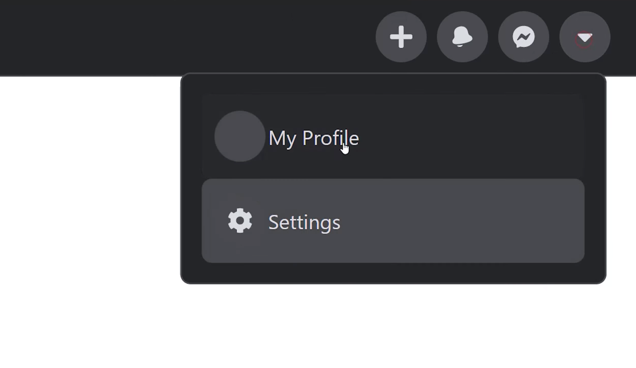
A basic dropdown
React
The DropdownItem contains slots to optionally add icons to the items.
function DropdownMenu() {


  function DropdownItem(props) {
    return (
      <a href="#" className="menu-item">
        <span className="icon-button">{props.leftIcon}</span>
        {props.children}
        <span className="icon-right">{props.rightIcon}</span>
      </a>
    );
  }

  return (
    <div className="dropdown">
        <DropdownItem>Foo</DropdownItem>
        <DropdownItem leftIcon={<BoltIcon />}>Bar</DropdownItem>
    </div>
  )
}
CSS
The dropdown has absolute positioning and overlaps the navbar slightly.
/* Dropdown Menu */

.dropdown {
  position: absolute;
  top: 58px;
  width: 300px;
  transform: translateX(-45%);
  background-color: var(--bg);
  border: var(--border);
  border-radius: var(--border-radius);
  padding: 1rem;
  overflow: hidden;
  transition: height var(--speed) ease;
}

.menu {
  width: 100%;
}

.menu-item {
  height: 50px;
  display: flex;
  align-items: center;
  border-radius: var(--border-radius);
  transition: background var(--speed);
  padding: 0.5rem;
}

.menu-item .icon-button {
  margin-right: 0.5rem;
}


.menu-item .icon-button:hover {
  filter: none;
}

.menu-item:hover {
  background-color: #525357;
}

.icon-right {
  margin-left: auto;
}
CSS Transition Animation
And now the fun part! Add multiple levels to the dropdown and animate the transition between them.
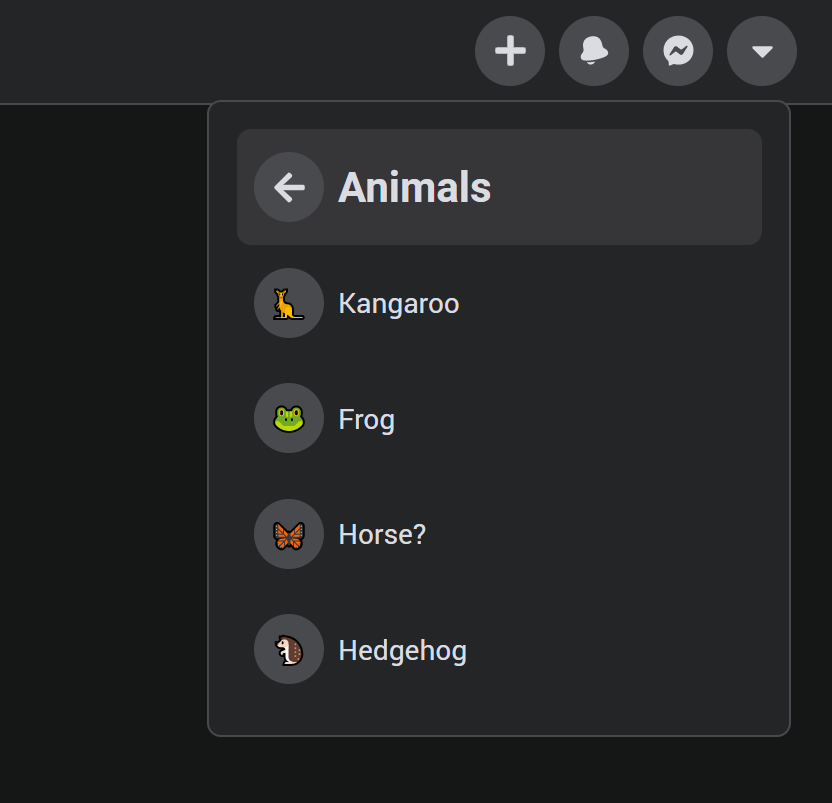
A multi-level dropdown in React
React
The dropdown is given the activeMenu state to control the name of the current menu. The CSSTransition component will only show its children if the in prop is truthy, which takes care of the conditional logic since only one menu can be visible at a time.
import { CSSTransition } from 'react-transition-group';

function DropdownMenu() {
  const [activeMenu, setActiveMenu] = useState('main');

  function DropdownItem(props) {
    return (
      <a href="#" className="menu-item" onClick={() => props.goToMenu && setActiveMenu(props.goToMenu)}>
        ...
      </a>
    );
  }

  return (
    <div className="dropdown">

      <CSSTransition
        in={activeMenu === 'main'}
        timeout={500}
        classNames="menu-primary"
        unmountOnExit>

        <div className="menu">
          <DropdownItem>My Profile</DropdownItem>
          <DropdownItem
            leftIcon={<CogIcon />}
            rightIcon={<ChevronIcon />}
            goToMenu="settings">
            Settings
          </DropdownItem>

        </div>
      </CSSTransition>

      <CSSTransition
        in={activeMenu === 'settings'}
        timeout={500}
        classNames="menu-secondary"
        unmountOnExit>

        <div className="menu">
          <DropdownItem goToMenu="main" leftIcon={<ArrowIcon />}>
            <h2>Go back</h2>
          </DropdownItem>
        </div>

      </CSSTransition>

    </div>
  );
}
CSS
All animation is handled by your CSS transition code. The CSS classes used here are determined by the classNames prop used on the CSSTransition. They will be automatically added/removed based on the state of the animation. Notice how we use translateX to slide the menus across the x-axis.
/* CSSTransition classes  */
.menu-primary-enter {
  position: absolute;
  transform: translateX(-110%);
}
.menu-primary-enter-active {
  transform: translateX(0%);
  transition: all var(--speed) ease;
}
.menu-primary-exit {
  position: absolute;
}
.menu-primary-exit-active {
  transform: translateX(-110%);
  transition: all var(--speed) ease;
}


.menu-secondary-enter {
  transform: translateX(110%);
}
.menu-secondary-enter-active {
  transform: translateX(0%);
  transition: all var(--speed) ease;
}
.menu-secondary-exit {

}
.menu-secondary-exit-active {
  transform: translateX(110%);
  transition: all var(--speed) ease;
}
Animate Menu Height
As a final touch, animate the height of the .dropdown container to avoid the abrupt height change between menu transitions. In order for CSS to animate the height, it must be an explicit value.
Use the onEnter lifecycle hook on the CSSTransition to get the height of the current menu, then set it on as the value on the parent dropdown.
React
function DropdownMenu() {

  const [menuHeight, setMenuHeight] = useState(null);

  function calcHeight(el) {
    const height = el.offsetHeight;
    setMenuHeight(height);
  }

  return (
    <div className="dropdown" style={{ height: menuHeight }}>

        <CSSTransition
            onEnter={calcHeight}
        >

  )
CSS
Animate the height changes with a CSS transition.
.dropdown {

  transition: height var(--speed) ease;
}