
Realtime Charts with D3
D3.js, or Data Driven Documents, is a powerful tool for building charts with JavaScript, CSS, and SVG. It’s a library that takes data as an input outputs dynamic, interactive, and beautiful visualizations. In this tutorial, we’ll build an animated realtime chart that changes its appearance when a new data point is added to Firestore.
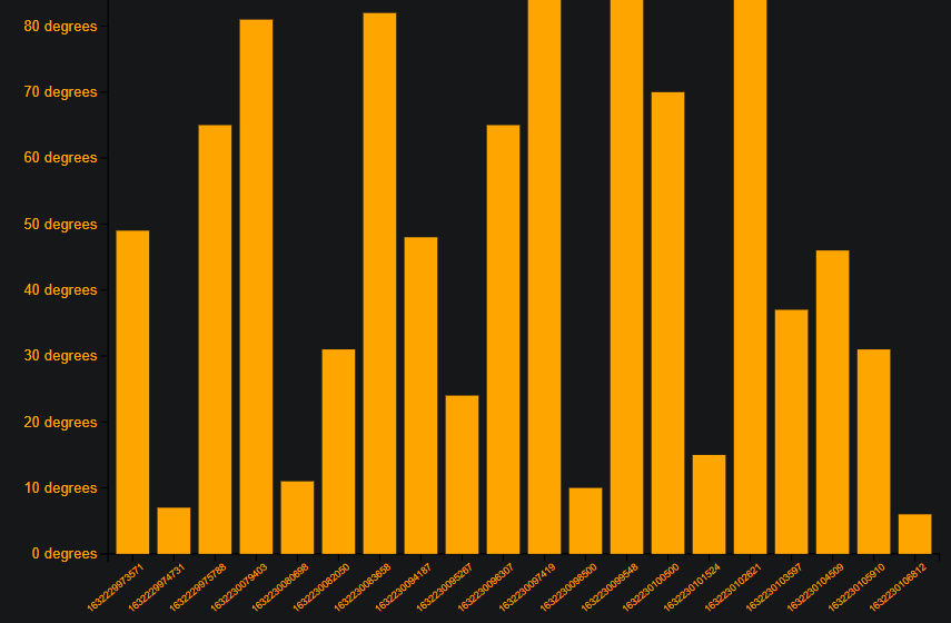
Example of the realtime chart you will build in this tutorial
Project Setup
Install D3 & Firebase
Create a new project with Vite, then install D3 and Firebase.
npm init vite d3fire

cd d3fire

npm i d3 firebase
Firestore Data Model
The data model for our chart is very simple. It’s a collection of Firestore documents, each with a date and temp field.
weather/{id}
   temp: number
   date: number
HTML
The HTML markup consists of a button and empty div.
<!-- Canvas for drawing the graph -->
<div class="canvas"></div>

<!-- Adds random temp data to firestore -->
<button type="button" id="add">Add data</button>
Firestore Weather Data
Add a Random Document
Add a random document to the weather collection when the button is clicked. It will have a date field with the current time, and a temp field with a random number between 0 and 100.
import * as d3 from 'd3';
import { collection, onSnapshot, addDoc, query, orderBy, limit } from 'firebase/firestore';
import db from './firebase';
const addButton = document.getElementById('add');

addButton.onclick = (e) => {
  return addDoc(collection(db, 'weatherr'), {
    // Random temperature between 0-100 degrees
    temp: Math.round(Math.random() * 100),
    date: Date.now(),
  });
};
Query Documents
Query the last 20 weather documents from Firestore. The orderBy and limit functions are used to sort and limit the results.
Note: The update function will be implemented in the next section to draw the chart with the data.
// Firestore reference
const ref = collection(db, 'weatherr');
const q = query(ref, limit(20), orderBy('date', 'desc'));

// Update Data source
// Firestore realtime data stream
let unsubscribe = onSnapshot(q, (docSnap) => {
  const data = docSnap.docs.map((doc) => doc.data()).reverse();
  update(data);
});

unsubscribe;
Bar Chart
Draw an Empty SVG
Stary the chart with an empty SVG by carefully choosing the dimensions and margins.
const svgWidth = 800;
const svgHeight = 600;

const svg = d3
  .select('.canvas')
  .append('svg')
  .attr('width', svgWidth)
  .attr('height', svgHeight)
  .style('border', '2px solid gray'); // Chart border

const margin = { top: 20, right: 20, bottom: 100, left: 100 };
const chartWidth = svgWidth - margin.left - margin.right;
const chartHeight = svgHeight - margin.top - margin.bottom;
Draw the X-axis and Y-axis
D3 has a built-in functions for drawing the X-axis and Y-axis. The challenge is to position the axes correctly and calculate the proper domain and range.
const chart = svg
  .append('g')
  .attr('width', chartWidth)
  .attr('height', chartHeight)
  .attr('transform', `translate(${margin.left}, ${margin.top})`);

// Initialize each axis
const xAxisGroup = chart.append('g').attr('transform', `translate(0, ${chartHeight})`);
const yAxisGroup = chart.append('g');

// Scaling band for the x-axis(timestamps)
const xScale = d3.scaleBand().range([0, chartWidth]).paddingInner(0.2).paddingOuter(0.2);

// Linear scaling for the y-axis(temperature)
const yScale = d3.scaleLinear().range([chartHeight, 0]);

// Scale the x-axis (timestamps)
const xAxis = d3.axisBottom(xScale);

// Adds a temperature label for every 10 degrees
const yAxis = d3
  .axisLeft(yScale)
  .ticks(10)
  .tickFormat((d) => `${d} degrees`);
Draw the Bars in Realtime
Finally, we take the data as an input and draw the bars (svg rects) based on the incoming Firestore collection. The selectAll function is used to select a rect for each item in the array passed to .data() - think of it like a forEach loop.
const update = (data) => {
  // Handle the scaling domains
  xScale.domain(data.map((item) => item.date));
  yScale.domain([0, d3.max(data, (d) => d.temp)]);

  const rects = chart.selectAll('rect').data(data);

  //Remove extra nodes from the DOM
  rects.exit().remove();

  // Initial chart scaling and styling for entries
  rects
    .attr('width', xScale.bandwidth)
    .attr('height', (d) => chartHeight - yScale(d.temp))
    .attr('x', (d) => xScale(d.date))
    .attr('y', (d) => yScale(d.temp))
    .style('fill', 'orange');

  xAxisGroup.call(xAxis);
  yAxisGroup.call(yAxis);

  // Handle the chart label styling
  xAxisGroup
    .selectAll('text')
    .attr('text-anchor', 'end')
    .attr('transform', 'rotate(-40)') // tilt the timestamps by 40 degrees
    .attr('fill', 'orange') // Timestamp(x-axis) color
    .attr('font-size', '0.5rem'); //  Timestamp(x-axis) font size

  yAxisGroup
    .selectAll('text')
    .attr('text-anchor', 'end')
    .attr('fill', 'orange') //  Temperature(y-axis) color
    .attr('font-size', '0.75rem'); // Temperature(y-axis) font size
};
Adding a Transition Animation
Add a transition animation to the bars using the transition method, followed by the attr method to set the height of the rects.
  // chart scaling and styling for new entries
  rects
    .enter()
    .append('rect')
    .attr('x', (d) => xScale(d.date))
    .attr('y', (d) => yScale(d.temp))
    .attr('width', xScale.bandwidth)
    .transition()
    .duration(1000)
    .attr('height', (d) => chartHeight - yScale(d.temp))
    .style('fill', 'orange') // Bar color