
Wavy Backgrounds with CSS & SVG
Wavy backgrounds have been all the rage in design for the last few years. The following tutorial demonstrates several different ways to create wavy backgrounds with CSS and SVG.
CSS Versions
Bubble Pattern
CSS Bubble
The bubble pattern creates an elliptical shape that stretches over the top of the content. It only requires CSS to create the effect.
    <section class="bubble">
      <!-- content here -->
    </section>
Use the pseudo-element ::after to style an eliptical border radius to the content.
.bubble::after {
    content: '';
    border-top-left-radius: 50% 100%;
    border-top-right-radius: 50% 100%;
    position: absolute;
    bottom: 0;
    z-index: -1;
    width: 100%;
    background-color: #0f0f10;
    height: 85%;
}
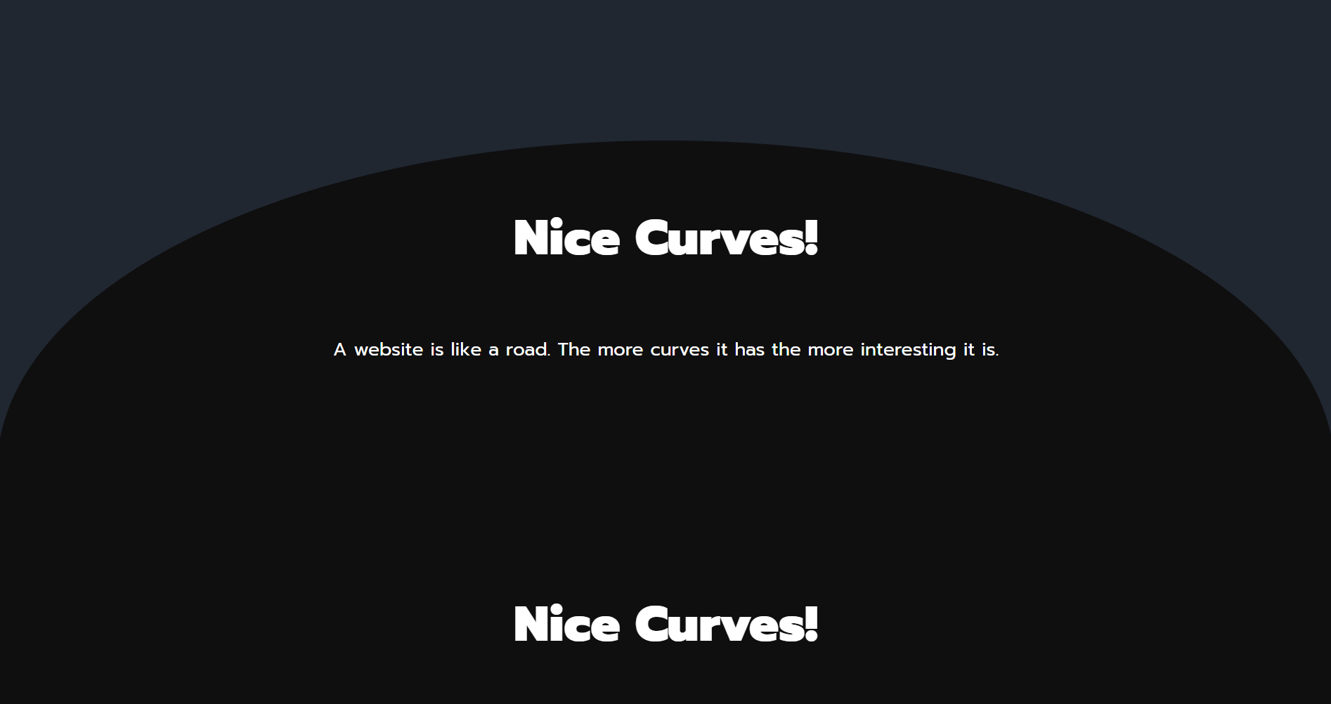
Wave Pattern
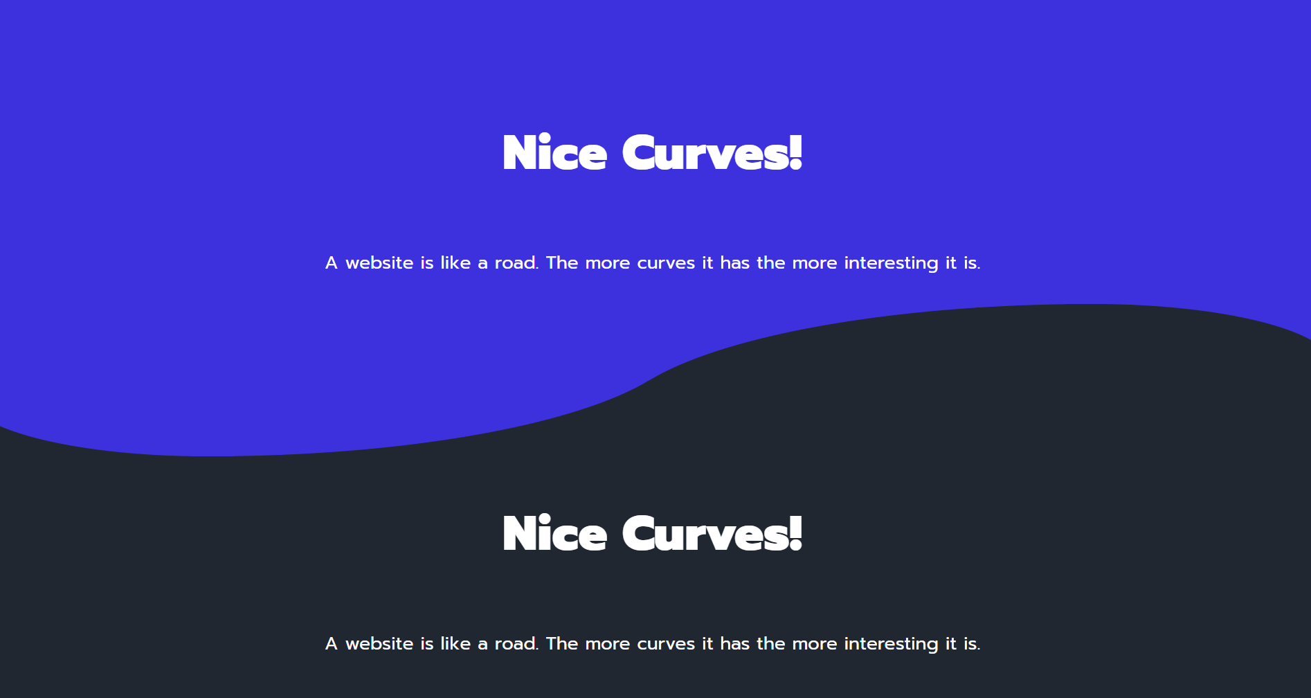
CSS Wave
The wave pattern overlaps two epliptical pseudo-elements. It it difficult to get the positioning perfect, but it will work well enough for most cases.
    <section>
      <!-- content here -->
      <div class="curve"></div>
    </section>
section {
    position: relative;
    display: flex;
    flex-direction: column;
    align-items: center;
    min-height: 400px;
    padding-top: 100px;
    background: #3c31dd;
}

.curve {
    position: absolute;
    height: 250px;
    width: 100%;
    bottom: 0;
    text-align: center;
}

.curve::before {
    content: '';
    display: block;
    position: absolute;
    border-radius: 100% 50%;
    width: 55%;
    height: 100%;
    transform: translate(85%, 60%);
    background-color: hsl(216, 21%, 16%);
}

.curve::after {
    content: '';
    display: block;
    position: absolute;
    border-radius: 100% 50%;
    width: 55%;
    height: 100%;
    background-color: #3c31dd;
    transform: translate(-4%, 40%);
    z-index: -1;
}
SVG Versions
The following examples create curved and wavy backgrounds using SVG images.
Layered Waves
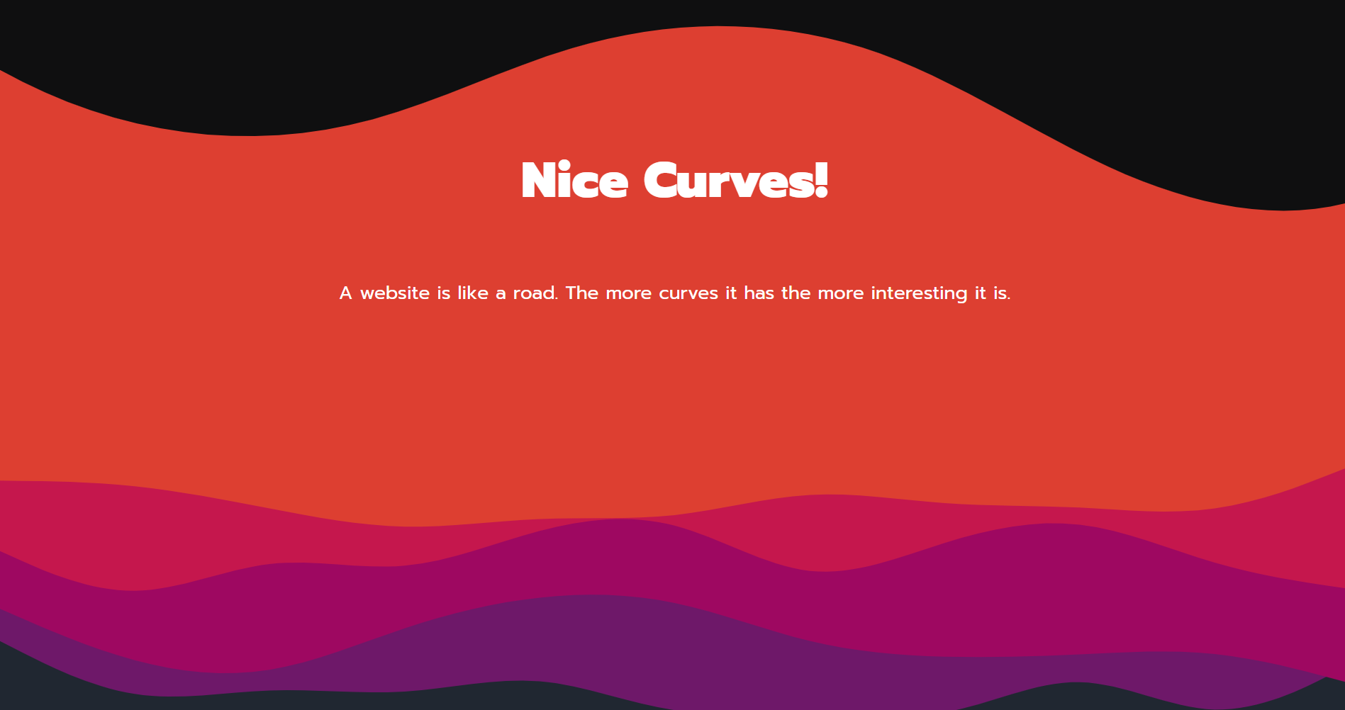
Layered SVG Wave
One of the easiest ways to add waves to an element is the ShapeDriver tool. It allows you to create a wave effect generating an SVG path and required CSS code to style it.
To add more complex layered waves, you can use the Haikei app to randomly generate a variety of beautiful waves, blobs, and other shapes. You can use any of these shapes as the background image of an element with CSS. Make sure the aspect ratio of the image matches the SVG exported from the app.
.spacer {
    aspect-ratio: 960/300;
    width: 100%;
    background-repeat: no-repeat;
    background-position: center;
    background-size: cover;
}

.layer1 {
    background-image: url('./your-image.svg');
}
Animated Blobs
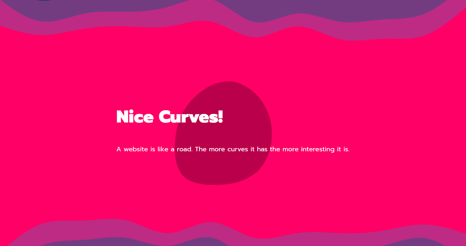
Animated SVG Blob
KUTE.js is a JavaScript library that makes it easy to animate SVG elements, or morph one shape into another. The code below can be applied to the paths of an inline SVG.
<svg>
    <path id="blob1" />
    <path id="blob2" style="visibility: hidden" />
</svg>
const tween = KUTE.fromTo(
    '#blob1',
    { path: '#blob1' },
    { path: '#blob2' },
    { repeat: 999, duration: 3000, yoyo: true }
).start();