
Flutter Flare 2D Animation Basics
Whenever I see an awesome UI element in a native app my first question is How do I make that in Flutter?. That’s exactly what I asked when I downloaded the Giphy Android app recently, which has runs a colorful and fun animation for each icon in the bottom navbar.
These animations are complex. Hypothetically, they could be created in Flutter natively with a custom painter, but that would be very challenging and painful. Thankfully, we have Flare 2D a design tool that makes it easy to create complex animations with vector graphics and run them in Flutter’s rendering engine at 60+ FPS.
Part 1: Create Animated Icons with Flare 2D
Access the files used in this lesson on my Flare profile or from the project github repo.
First, we need to create some awesome animated graphics with Flare. Create a free account, then complete the tasks below. These tasks represent the skills you need to have in Flare to re-create Giphy’s animated icons.
I highly recommend memorizing the following hotkeys.
Ttranslate or move shapes around.Sscale or resize shapes.Rrotate shapes.- Hold
spaceto drag around the screen. ctrl+Zto undo.
Draw a Shape
Flare provides a basic set of design tools that we can use to draw vector graphics. You can also design your graphics in a different tool, like Figma or Sketch for example, then import them into Flare.
Tasks
- Draw a basic star shape using the star tool.
- Center it on the artboard and have it take up as much space on the Y axis as possible.
- Remove the stroke and adjust the fill color.
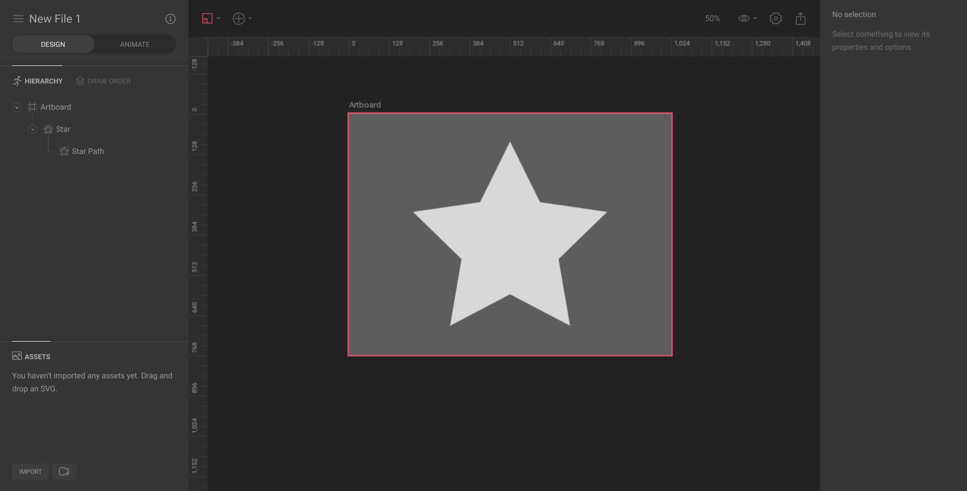
Draw a star
Animate the Fill Color
We can animate almost anything on the shape. Let’s get familiar with the animation timeline by animating the color of the star from gray to yellow.
Tasks
- Switch to animation mode.
- Change the untitled animation name to go (this will be important when we get the Flutter code).
- Create a keyframe by selecting the diamond next to the fill control.
- Scrub the timeline to the end and change the fill color. A new keyfame would be added automatically.
- Press play. You just created an animation.
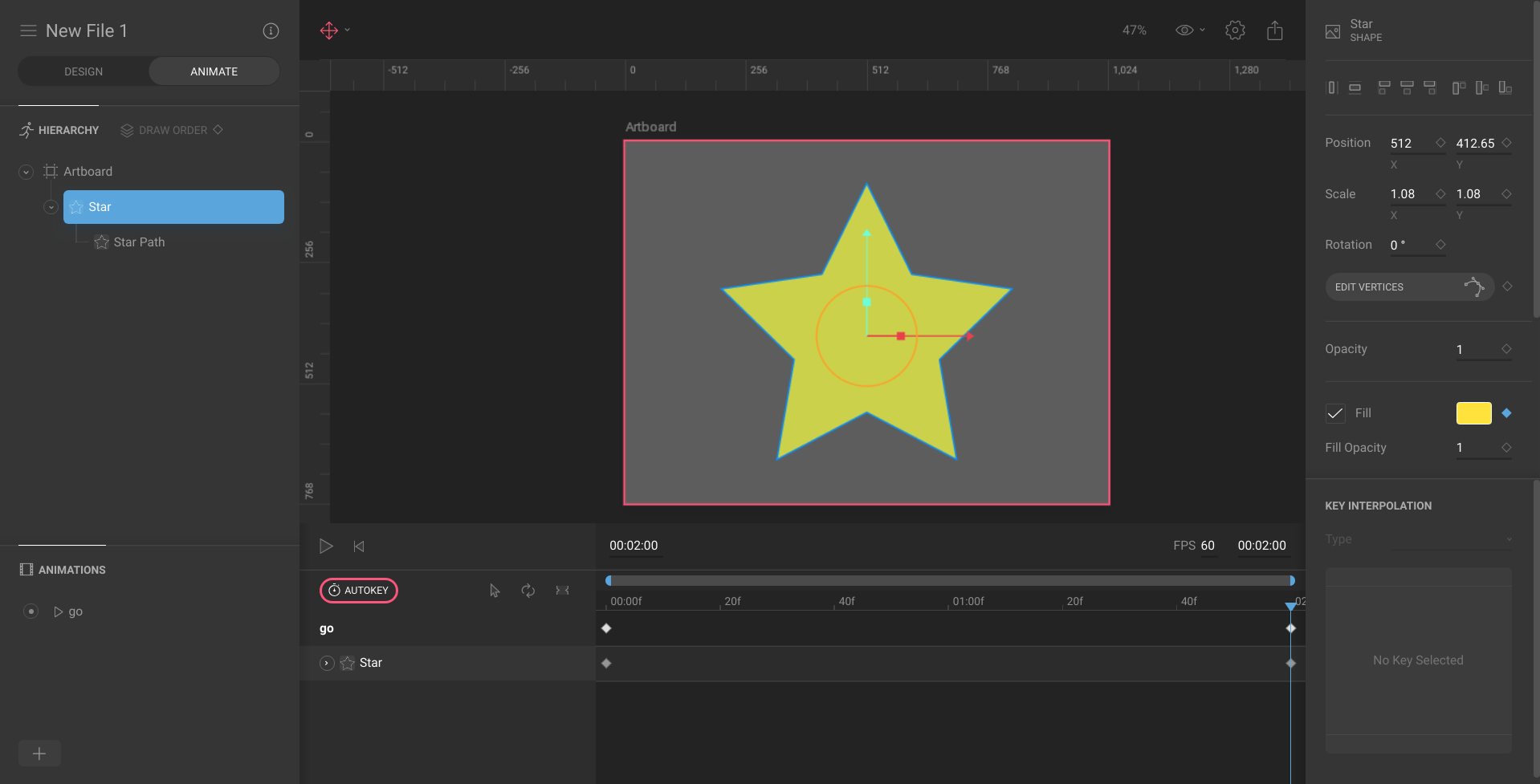
Animate the fill color of the star
Animate Transformations - Translate, Scale, Rotate
An easy way to bring your shapes to life is by animating size, movement, and rotation angle.
Tasks
- Create keyframes for rotation and scale.
- Adjust the key interpolation to make to ease the timing.
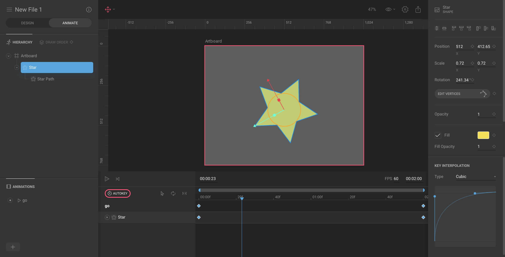
Animate the rotation of the star and change the key interpolation to cubic
Animate the Shape
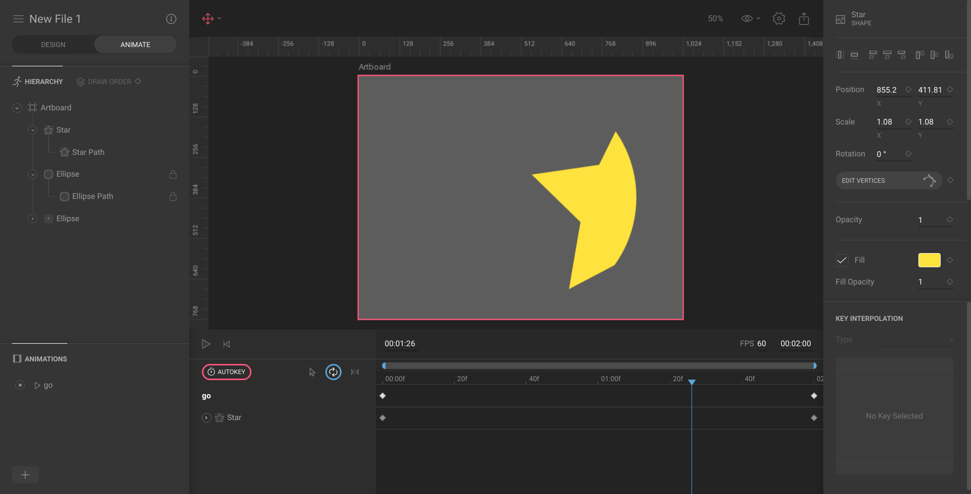
We can also animate the verticies of the star to to transform it into a completely different shape.
Tasks
- Add a keyframe to edit verticies.
- Click “edit verticies”, scrub to a different time, move the verticies to automatically add a keyframe.
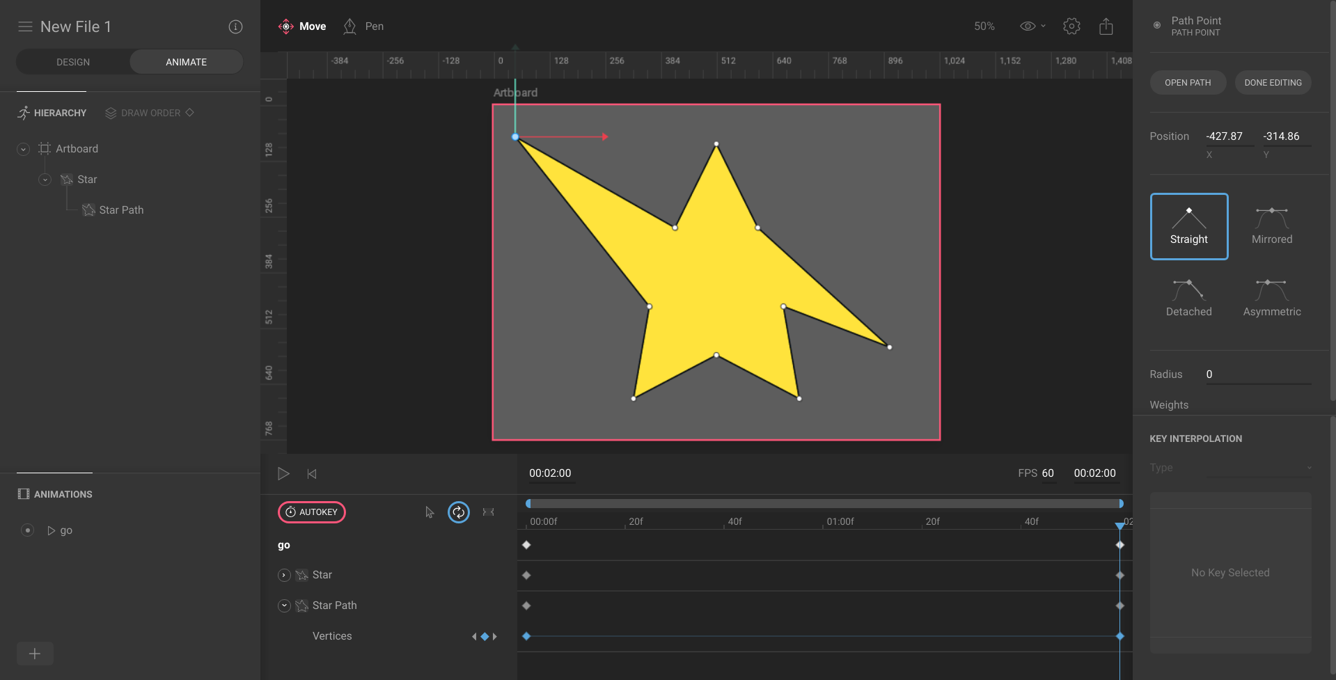
Use the verticies to change and animate the points of the shape
Animate the Stroke for a Hand-Drawn Effect
Stroke animations make it easy to look like you are drawing a shape by hand.
Tasks
- Give the shape a stroke.
- Set the end of the stroke to 0% until it is invisible.
- Animate the end value to give it a drawing effect.
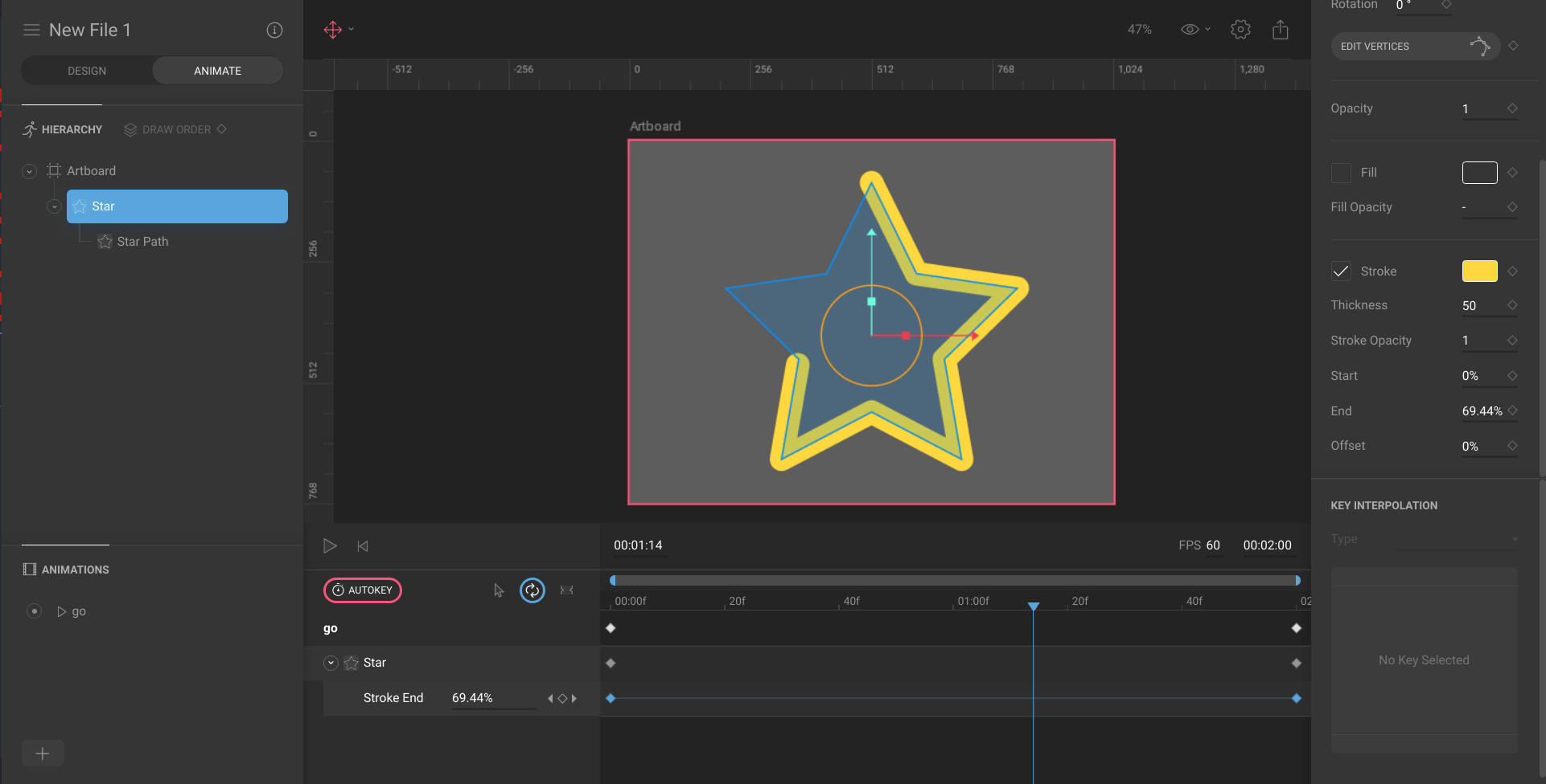
Animate the stroke end from 0% to 100%
Animate the Position in a Clipping Mask
Clipping masks allow you to make shapes disappear behind another shape. A clipping mask is like installing a window on the house - you can only see the contents inside its boundaries.
Tasks
- Create a new shape that covers the star.
- Select the star, then click clipping box, then select the new shape.
- Go into animation mode and animate the position of the star.
Create another shape to serve as a clipping box for the star.
Part 2 - Flutter Flare Integration
Flare provides package that makes it dead simple to use our animations into an iOS or Android app with Flutter. Run to flutter create your_project to get started. The end goal is to build a usable animated icon navigation menu like the demo below:
Add flare_flutter to pubspec.yaml
Add flare_flutter to the pubspec.yaml.
dependencies:
  flutter:
    sdk: flutter

  flare_flutter: any


flutter:
  uses-material-design: true
  assets:
   - assets/
Export your Animations to Flutter
Export the animations to a folder named assets in the root of your project.
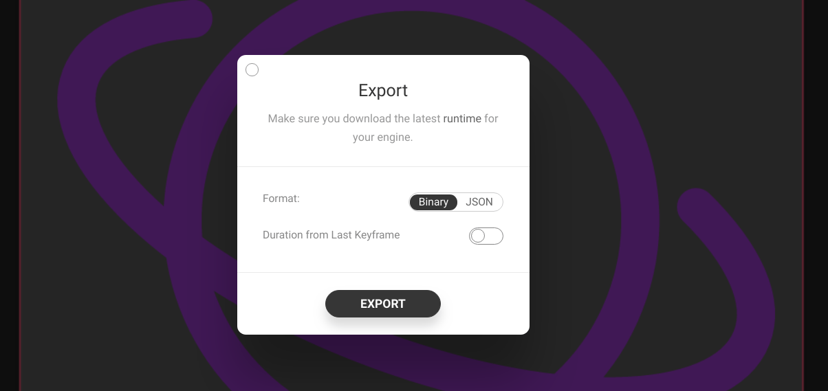
Export the binary file from Flare
Define a Class for the Menu Item
There are many different ways to build a menu in flutter, but we’re going to build our navigation menu from scratch. The data for each menu item can be abstracted into a class.
nameis the filename of the .flr assetcolorcontrols the line above the iconxis the X-axis alignment of the item (-1 is far left, 1 is far right).
class MenuItem {
  final String name;
  final Color color;
  final double x;
  MenuItem({this.name, this.color, this.x});
}
Animating the Colored Top Bar
Our navigation menu is wrapped in a StatefulWidget to keep track of the currently selected item. Here’s a breakdown of each important line of code.
- Set a default menu item on
initState. - Define a Stack. The first element is an container for the colored , while the second item is the navigation menu row..
- Create an AnimatedContainer that takes up 20% of the screen width and is aligned to the active menu item.
- Define a Row to hold the Flare graphics that uses
spaceAroundalignment on the main axis.
class NavBar extends StatefulWidget {
  createState() => NavBarState();
}

class NavBarState extends State<NavBar> {
  List items = [
    MenuItem(x: -1.0, name: 'house', color: Colors.lightBlue[100]),
    MenuItem(x: -0.5, name: 'planet', color: Colors.purple),
    MenuItem(x: 0.0, name: 'camera', color: Colors.greenAccent),
    MenuItem(x: 0.5, name: 'heart', color: Colors.pink),
    MenuItem(x: 1.0, name: 'head', color: Colors.yellow),
  ];

  MenuItem active;

  @override
  void initState() {
    super.initState();

    active = items[0]; // <-- 1. Activate a menu item
  }

  @override
  Widget build(BuildContext context) {
    double w = MediaQuery.of(context).size.width;
    return Container(
      height: 80,
      color: Colors.black,
      child: Stack(    //  <-- 2. Define a stack
        children: [
          AnimatedContainer(  //  <-- 3. Animated top bar
            duration: Duration(milliseconds: 200),
            alignment: Alignment(active.x, -1),
            child: AnimatedContainer(
              duration: Duration(milliseconds: 1000),
              height: 8,
              width: w * 0.2,
              color: active.color,
            ),
          ),
          Container(  // <-- 4. Main menu row
            child: Row(
              mainAxisAlignment: MainAxisAlignment.spaceAround,
              crossAxisAlignment: CrossAxisAlignment.end,
              children: items.map((item) {
                return _flare(item);  // <-- 5. Flare graphic will go here
            ),
          )
        ],
      ),
    );
  }

}
Animating the Flare Graphics
In this final section, we define a method that will turn the Flare animations into tap-able buttons that change the state of the widget. This can be achieved with a setState call from a GestureDetector, as we do not want Material ink splashes in this demo.
The FlareActor is a widget from the flare_flutter package that that will run the specified animation when the state changes.
Remember, we defined the animation name as go in the Flare editor before exporting the file. By default, the animation name is Untitled.
  Widget _flare(MenuItem item) {
    return GestureDetector(
      child: AspectRatio(
        aspectRatio: 1,
        child: Padding(
          padding: EdgeInsets.only(top: 20),
          child: FlareActor(
            'assets/${item.name}.flr',
            alignment: Alignment.center,
            fit: BoxFit.contain,
            animation: item.name == active.name ? 'go' : 'idle',
          ),
        ),
      ),
      onTap: () {
        setState(() {
          active = item;
        });
      },
    );
  }